 Went to the Met yesterday with my friend Carol and saw two exhibitions that, when visited consecutively, make for some interesting comparisons. The first was a show containing German portraits from the 20s, the second, titled "Americans in Paris", focussed on late 19th century US expatriate work.
I've never been very enthusiastic about the former whose ranks include Max Beckmann, Otto Dix, George Grosz, etc. This despite the fact that my most important painting teacher, Alton Pickens, came very much out of that tradition. My main issue probably has to do with my aversion to caricature, of being told how one should react to an image or person rather than allowing the viewer (or listener or reader) to work it out for himself. If the subject of a painting is, in the artist's mind, evil, shallow, vile, etc., I'd prefer that those qualites emerge from a careful viewing of his personage, not from warped eyes, horns sprouting from head, coins being rubbed between fingers and so on. It's like in a crappy, normal movie where the casting of the "bad guy" involves finding an actor with shifty eyes, a 5 o'clock shadow, whatever, essentially screaming at you, "This guy is bad!". One feels pushed. (I'm reminded of the wonderful John Cage line when, while fidgeting through a performance of "The Messiah", w
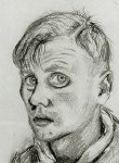 as asked by his concert companion Peggy Guggenheim (iirc) if he didn't like being moved. "I don't mind being moved," he replied, "I just don't like to be pushed.") Whatever technical or aesthetic prowess appears--and many of the works here are quite impressive to look out on those grounds--that sense of being sledgehammered tends to be rife. There are exceptions, to be sure. Christian Schad, one of whose works appears above, is far more subtle even, a la Velazquez, investing his "freakish" subjects with a quiet, sad dignity. I found Schad's work as represented in this show, generally very interesting and understated, disturbing even if you're not sure why. I also thought this self-portrait by Karl Hubbuch was striking and disquieting. As an aside, it was intriguing to see how long a shadow had been cast by Durer, intimations of whom could be seen throughout the exhibition.
The "Americans in Paris" show, on the other hand, while populated by a far higher percentage of bland works (American Impressionists, in particular, have never greatly impressed me) contains several portraits that exactly get to what I prize wherein the viewer has to exercise his brain and read into the figures and their environment. I've always had a weakness for John Singer Sargent whose bravura technqiue may sometimes get in the way of his acute obser
 vational powers (his watercolors! Unbelievable stuff). While at the School of the Museum of Fine Arts in Boston ('74-'75) I spent many an hour in front of this baby. On one level, of course, it's a kind of society group portrait. The girls are clearly privileged and comfortable. But the picture on the whole, with its dark, looming background, its oversized vases, etc. implies an uncertain future and, in my view, casts doubt on exactly how comfortable this family really is in other than material terms. The vast distances between the subjects. Plus, admittedly, it's just gorgeously painted, with "Las Meninas" clearly in mind.
There was another portrait, I think by Charles Curran (though I can't locate a reproduction) where the sitter's eyes, obscured behind fogged spectacles, cause one to puzzle over his character, looking for other clues in the accompanying objects, his stance, the position of his hands, etc. You can't be quite sure about it. A given Dix might be a better painting in a number of respects (a lack of academic quality among them), but a Sargent or Curran provides far more latitude to the viewer to make his/her own judgments and interpretations, without being pushed. The parallels, from such an odd choice of areas, to contemporary eai, are interesting......
2 comments:
Hello.
I had to visit the Met for a college art paper and I went to the Americans in Paris section and picked out Curran and Sargent to write about. How coincidental is that? Don't worry, I'm not plagiarizing your work. I'm doing their other works. But nice site!
Ben
scratchynails.blogspot.com
Hey Ben,
Well, as I said, Sargent's always registered with me, even at his most "superficial"/ There's an Italian version of Sargent too, Boldini, who's also interesting in a flashy way. Curran was a new name to me, I think. Very cool use of color in some of those small Parisian street scenes, the orange-red of an umbrella against the greenery, etc. You could squint and it looks like a n Ellsworth Kelly.
Post a Comment